· Admin · 3 min read
Inside Your Customer's Mind: What They Demand From a Website in 2026
Put yourself in your visitor's shoes. See how motion vectors, instant cloud loading, and friction-free navigation turn a casual visitor into a loyal customer.

The Reality: Your customer isn’t looking for a “website.” They are looking for a solution to their problem, and they are in a hurry. Here is exactly what goes through their mind when they land on a site built with our 2026 standards.
The 4-Step Journey of a Happy Visitor
We don’t just design for you; we design for the people paying you. Here is the experience we engineer for every visitor landing on your site:
1. The “Wow” Moment (Visual Engagement)
What they used to see: A boring static image or a generic stock photo that looks like every other Kuching business.
What they see now (Flying Vectors): “I opened the link and—whoa. The graphics are moving. It feels alive.”
By using custom flying vectors, we capture their attention instantly. It tells the visitor, “This company is modern, professional, and pays attention to detail.” It’s not a distraction; it’s a hook that keeps them from hitting the ‘Back’ button.
2. The “Zero-Wait” Gratification (Speed)
What they used to see: A white screen loading for 5 seconds while they stare at their phone on a slow 4G connection.
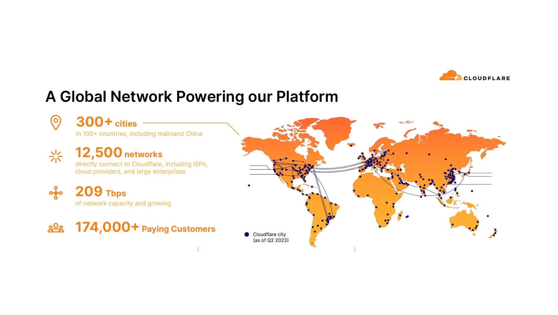
What they see now (Cloudflare 330 Cities): “I tapped the link and the content was there instantly.”
Because we use Serverless architecture across 330 cities, your website literally meets the customer where they are. Whether they are browsing from a cafe in Padungan or a hotel in Singapore, the data travels the shortest distance possible. To the visitor, your business feels efficient and reliable.
3. The “I Found It!” Relief (Navigation)
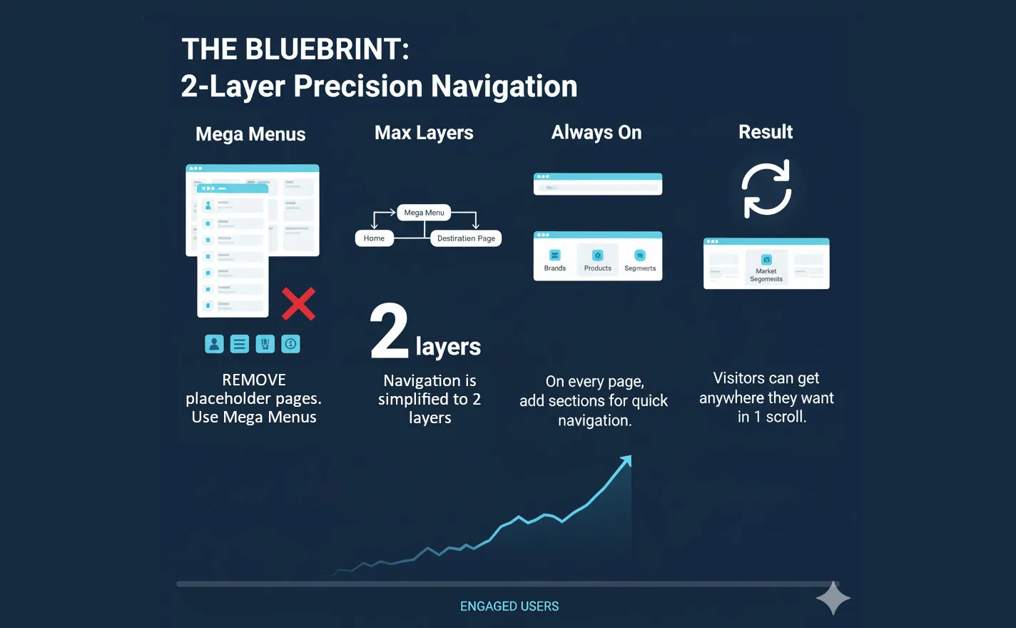
What they used to see: A maze of dropdown menus, confusing jargon, and hunting for a ‘Contact Us’ button.
What they see now (2-Layer Max): “I need pricing. Click. There it is. I need to WhatsApp them. Click. Done.”
We enforce a clean, 2-layer maximum navigation structure. Complex options are organized into intuitive Mega Menus. The visitor never feels lost or stupid; they feel empowered because the path to purchase is obstacle-free.
4. The “Safe Space” Feeling (Security)
- What they used to see: Browser warnings, suspicious redirects, or slow, clunky forms.
- What they see now (Security): “This feels legitimate. The lock icon is there, the page is stable, and no spammy pop-ups are blocking my view.”
By baking enterprise-grade security and privacy into the infrastructure, we subconsciously signal to the visitor that their data is safe. In an era of scams, this invisible layer of trust is often the deciding factor between a bounce and a sale.
Case Study: The “Impulse Buy” Experience
The Scenario A tourist in Kuching is looking for a last-minute river cruise booking on a rainy afternoon with spotty mobile data.
The Old Experience Site takes 8 seconds to load video background. Menu is tiny. Tourist gives up and checks a competitor.
The 2026 Experience (Our Build)
- Load: Site loads in 0.6s (Cloudflare Edge).
- Visual: A lightweight vector animation of a boat on the river plays smoothly.
- Action: The “Book Now” button is front and center.
- Result: Tourist books a ticket in 3 taps.
Why It Worked: We removed the friction.
Is Your Website Treating Your Visitors Right?
If your site is slow, static, and confusing, you aren’t just losing traffic—you are frustrating potential clients.
Give your customers the experience they deserve. Upgrade Your UX Today | See the Difference
14-year track record
- User Experience (UX)
- Customer Psychology
- Web Performance
- Mobile Design
- Trust & Security